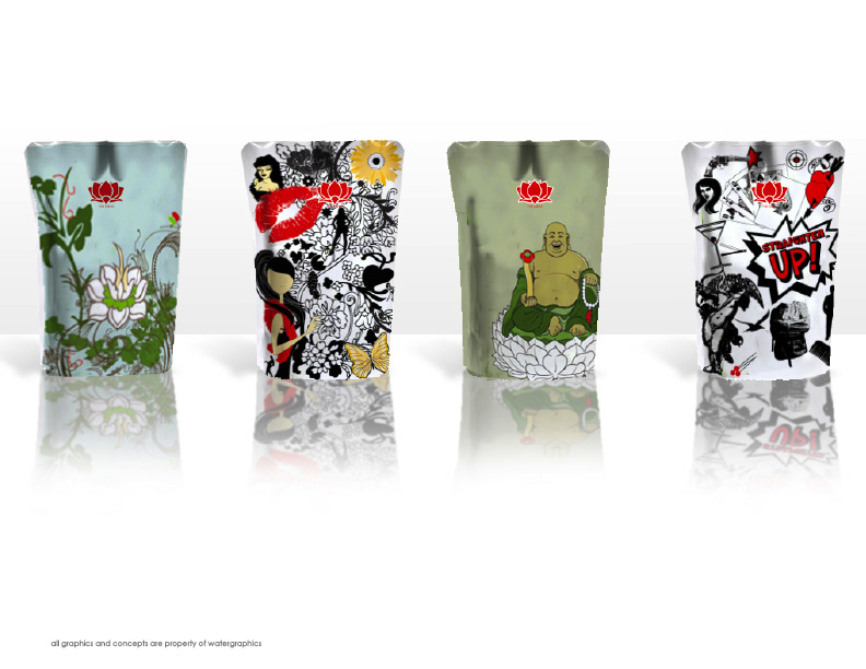
Flat Iron Packaging
national distributed in Target stores
national distributed in Target stores
client sought out new, extremely different an edgy packaging, something they've never seen on a shelf before. After a international search, they chose watergraphics.
I started out researching what had been done (boxes) --So, I gave them a SACK! Bold graphics each with a different theme was created in addition, watergraphics then created the actual irons to partner each theme. Our favorite is "Straighten Up! ™" was developed while I was really REALLY mad at my boyfriend, all images are STRAIGHT (straight jacket, straight through the heart, straight up martini, straight pins, straight flush, etc.) I put a gun in there too-"straight shot" -I'm not mad any more, in fact he's visiting for an extended Thanksgiving vacation --who knows what project I'll explode on while he's here.
I started out researching what had been done (boxes) --So, I gave them a SACK! Bold graphics each with a different theme was created in addition, watergraphics then created the actual irons to partner each theme. Our favorite is "Straighten Up! ™" was developed while I was really REALLY mad at my boyfriend, all images are STRAIGHT (straight jacket, straight through the heart, straight up martini, straight pins, straight flush, etc.) I put a gun in there too-"straight shot" -I'm not mad any more, in fact he's visiting for an extended Thanksgiving vacation --who knows what project I'll explode on while he's here.